Background
The travel department within the LDS Missionary Training center had been using a 16 year old program written in Delphi. Understandably, the app had become to require more and more maintenance. After administrative approval, we began meeting with them to lay out their needs and hopes for a replacement app.
Research
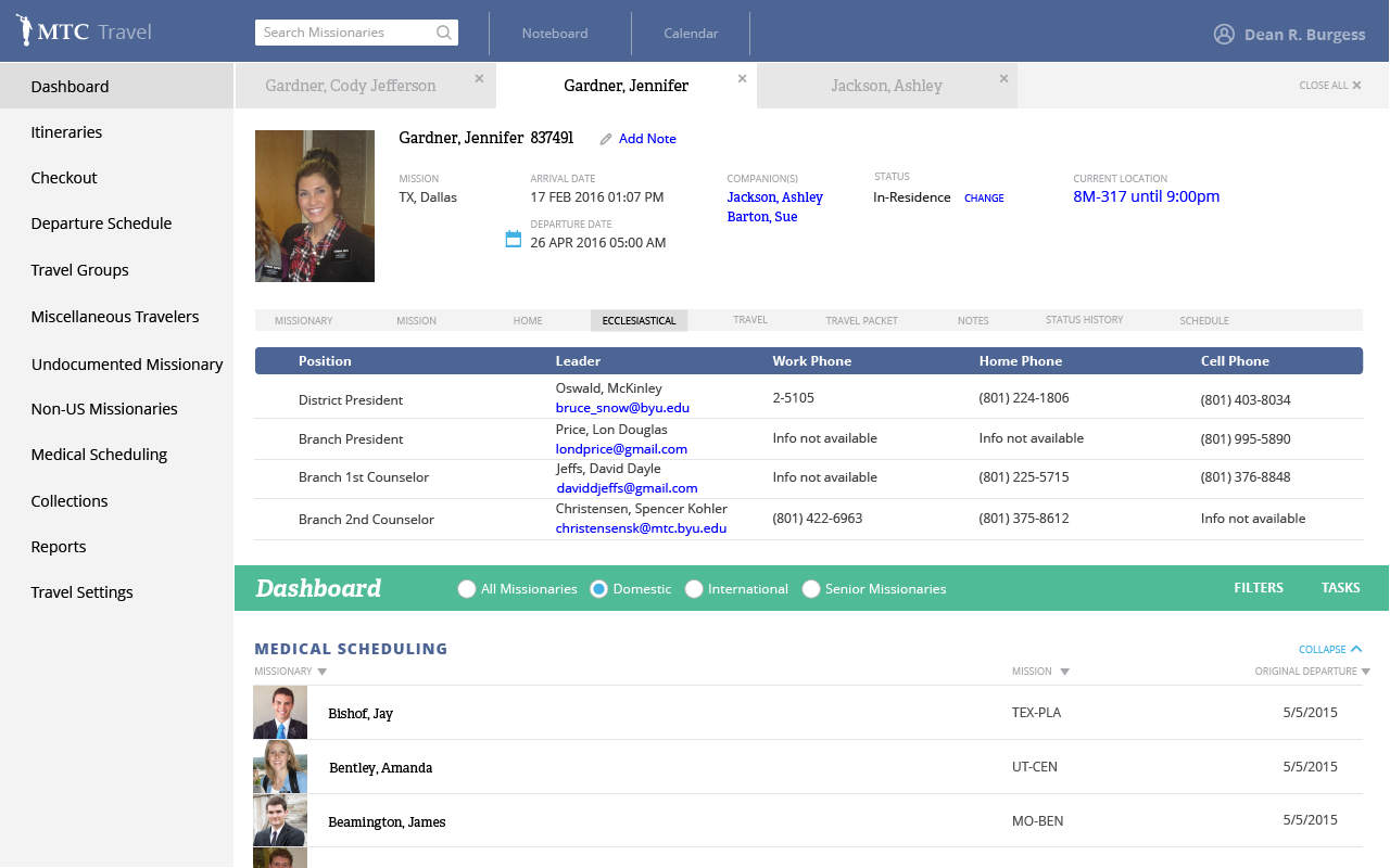
We met with them over the course of several months to understand the scope of the project and become familiar with their processes. Much of the issues we found with their older product revolved around multiple related pieces of information being seperated across several different sections. For example, creating a travel group of several people would require checking up to 3 different areas of the app to cross check data and travel eligibility. We made it our goal to make more logical groups of information so that any given task the department needed to complete could be done with minimal different page views.
We also learned that there were many tasks that were still being done with binders of paper and copying. We worked with the department to see how we could best digitize as much of the work as possible and automate as many of the tasks that were feasible.
Sketching/Wireframes
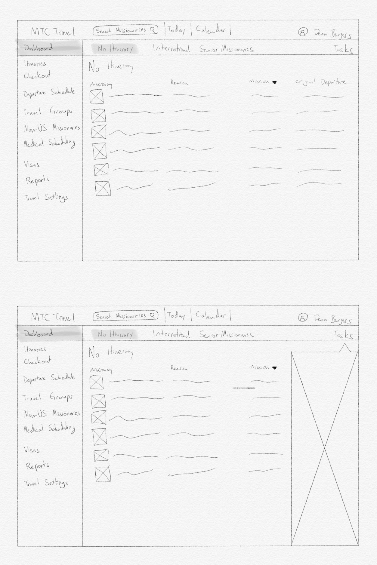
Once those ideation meetings had begun, we begun the initial design phase. A few third parties had done some early designs and I incorporated those ideas while doing wireframes and early user testing.
Iterating
Iteration and testing was a huge portion of the design process for this product. The previous application was so out of date and the travel office was so engrained in their process that a lot of discovery needed to be done in order to both deliver the functionality that they needed, while simultaneously streamlining the processes and building a modern UI.
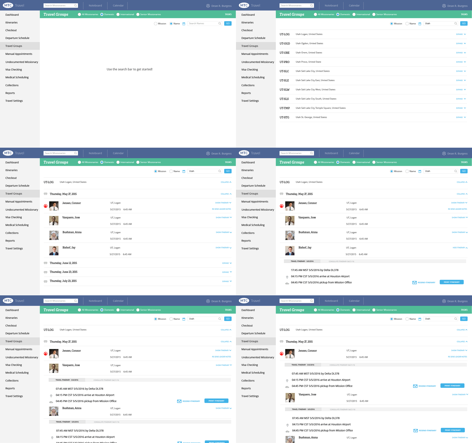
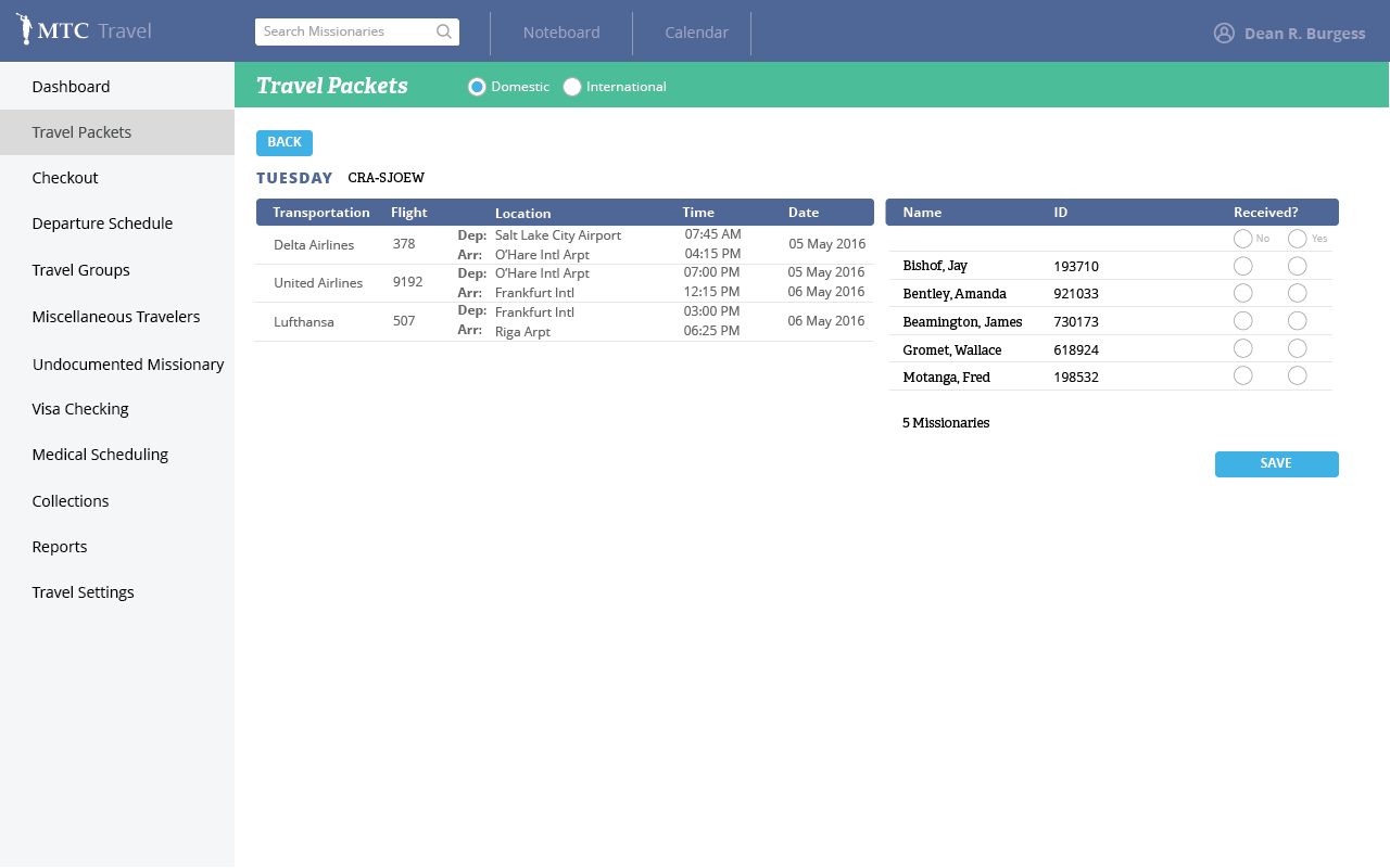
One instance where the interface changed considerably was viewing travel groups. The users had initially described their process as being able to see every separate missionary in a list view with their itinerary attached. I designed a few options, we settled on one, and it was built. After using it for a few weeks however, employees in the travel office reported that being able to see all of the itineraries for the travel group was a huge pain point. Since I had tried to recreate their old process only slightly tweaked, it resulted in a terrible accordion that required a massive amount of expanding and scrolling to be able to see the entire group’s data.. After some more thought, I designed a simplified two column view that allowed being able to see the itinerary and all of the missionaries of the group at the same time with few clicks and little to no scrolling.

High Fidelity Mocks
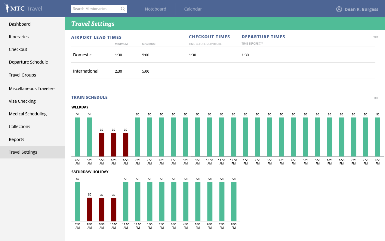
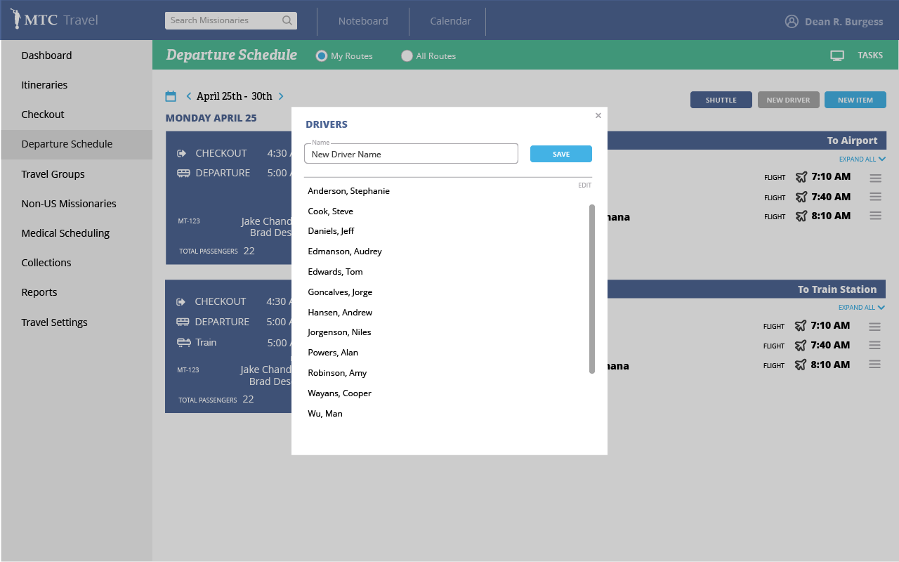
This product is currently in use at the MTC and new features are routinely being developed.
Takeaways
I learned a lot about working with stakeholders during this project. We (the project managers and I) ran into several issues where stakeholders would reject designs for seemingly no reason. We then went out of our way to involve stakeholders in every step of the process as much as feasible and they were much more accepting of our work, as they then felt it was their work as well.
