
Problem
A language learning activities application needs a small mobile version that was not initially part of the requirements. It must have complete feature parity with the desktop web and tablet applications.
Background
Scrimmage is the activity portion of the TALL suite of language learning applications developed at the Provo Missionary Training Center. It was initially conceived as a web only product, but partway through development, the product team pivoted the scope of the project to include native tablet apps as well. In the eleventh hour, stakeholders informed us of a pilot program taking place where missionaries would be using smartphones and this activities app would need an appropriate native version. As part of the design team, I worked to convert the tablet designs for the first version of the product to the smartphone size. All versions needed to have complete functional parity across all platforms while still maintaining usability.
Exploratory Research
I took a look at similar products (like Duolingo) to see how they handled UI changes amongst differing screen sizes, but this proved to be slightly fruitless as competing products featured more simple HUDS and thus were able to easily allow greatest focus on the language content. Our approach to the activities introduced elements of gamification that were not easily translated to the smaller screen sizes.
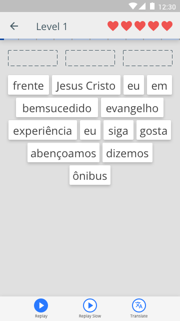
Wireframes
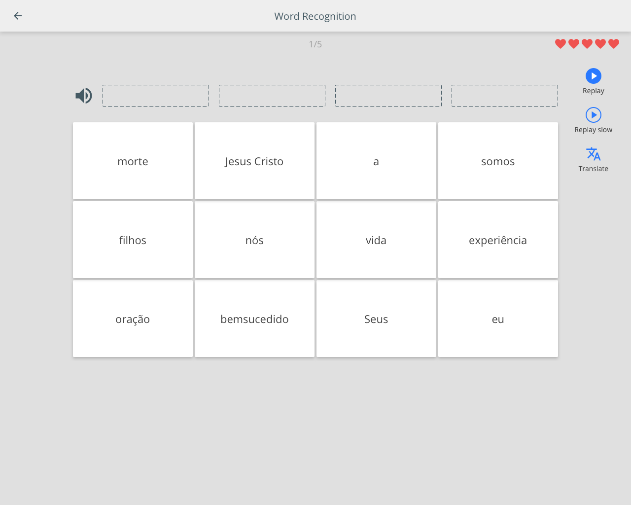
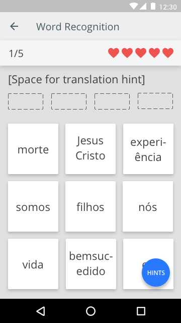
I started exploring ways of laying out all of the data that was displayed in the web mocks on a phone screen.
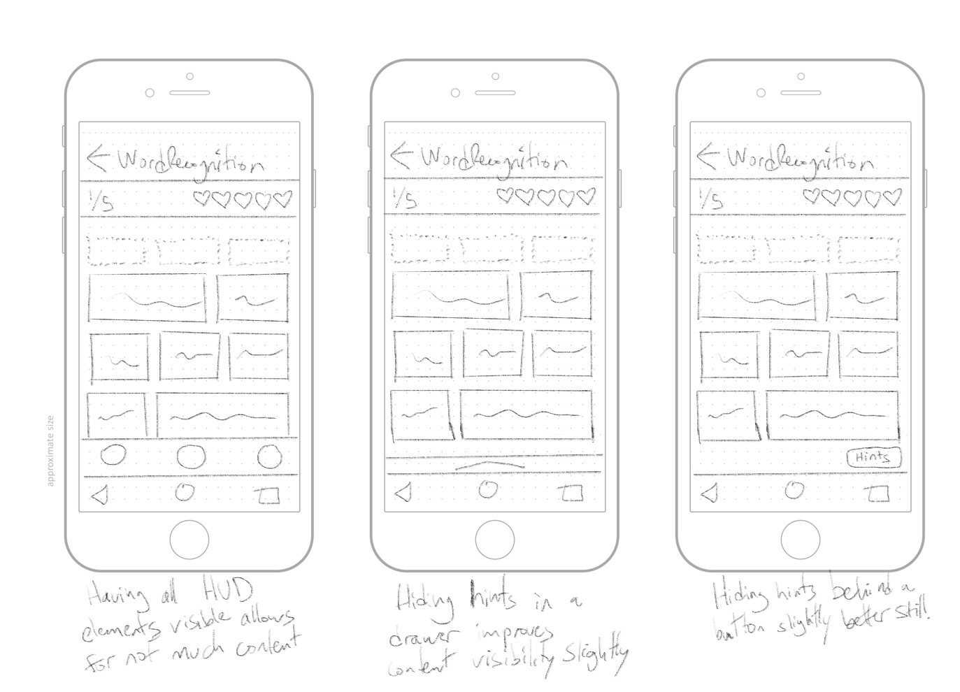
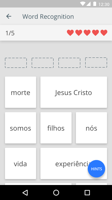
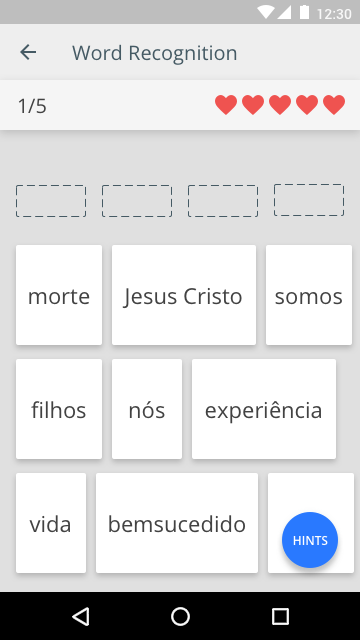
The phone posed unique difficulties, with the HUD generally clogging up the majority of the screen space. Most of the information was deemed critical, however, and could not be hidden dynamically. The only functionality that appeared appropriate to nest were the hints used during activities. I eventually settled on the idea of hiding the hints behind a floating action button.
Testing
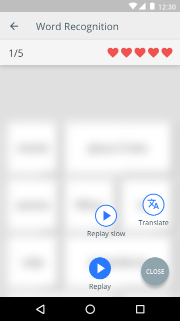
I spent several days testing the button for discoverability and usability with members of the potential userbase. It tested very well, being compared favorably to several similar menus (ex. adding meals in MyFitnessPal) and I went ahead refining the design until I decided on this final design.
Iteration
When I had finished the high fidelity mocks, the team began to have discussions about the size of the cards used in the activities and whether or not they could be shrunk to display more cards at one time. I pushed back citing concerns about tap target sizes and overwhelming users with options as some of the activities would use as many as 32 cards. Key stake holders expressed desire to shrink the cards so that more content could be displayed so I began creating quick designs that could be tested.
The tap targets ended up not being an issue and the amount of information present on one screen did not overwhelm the users, but actually ended up making the cards more glanceable as less scrolling was required. Ironically, Duolingo was part of the initial research for mobile designs and uses very small cards, like we decided on in the final designs.
Research into education programs helped prioritize the activity content and reduce the amount of information deemed absolutely critical. This research also helped make decisions about hiding commonly used features behind menus (like my hints button concept) leading the idea to get scrapped as to not cause unncessary cognitive load on the user during the activity. Instead, we were able to drastically simplify the HUD for mobile devices.
High Fidelity Mocks
With this new research and testing on the card sizes, I created this finalized design with smaller cards and unique top menu bar. After confirming that the bottom Android navigation bar could be hid by default when using activities, I settled on a bottom bar for the hints, keeping them within constant reach, but still unobstrusive.
Outcomes
An optimized smartphone version of the design was created. Many of the intial decisions were revisted and changed to create an experience which allowed the activity's content to take priority. The menus and HUD were redesigned to balance between taking up as little space as possible, but without burying any functionality.
Takeaways
This was only my second experience with taking a desktop web product and converting it to a mobile design and I learned a lot about affordances. Even though every single part of the desktop web UI was initially deemed essential, we were able to not only optimize the cards for smaller screen sizes, but simplify the HUD to its bare minimum.
I also learned the hard lesson that a beautiful, intuitive, and tested feature can no longer be used when it no longer makes sense within the new paradigm of an evolving product. I learned to not get attached to features or microinteractions, because a refinement elsewhere in the product might render them redundant or obtrusive.