
Problem
Customers used Redlist Maintenance to schedule preventative and reactive maintenance for their equipment. This feature was out dated, difficult to maintain, and hard for users to understand.
Background
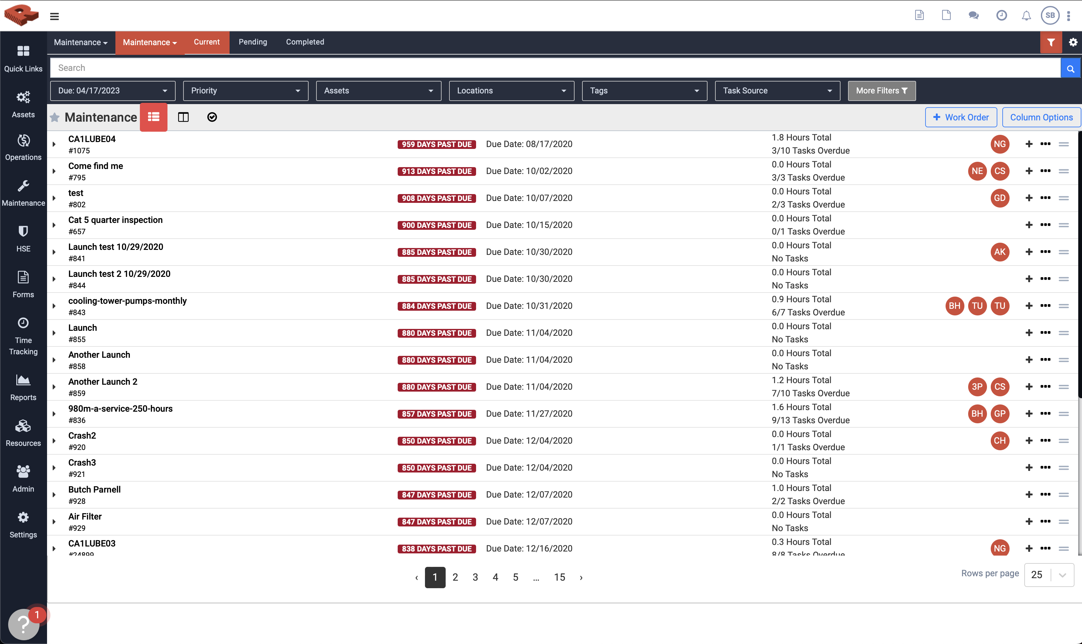
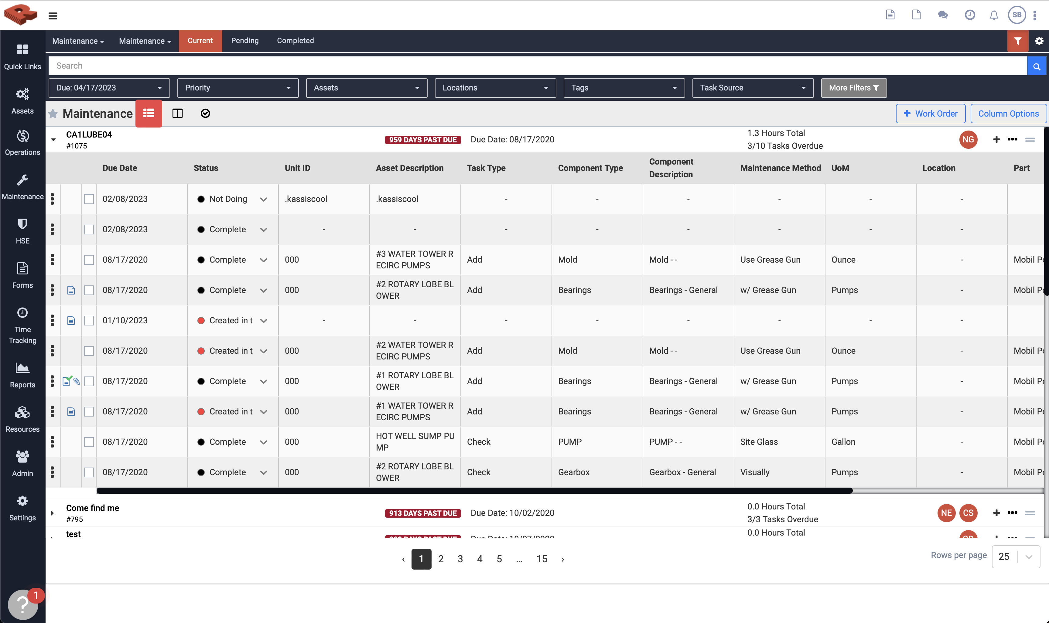
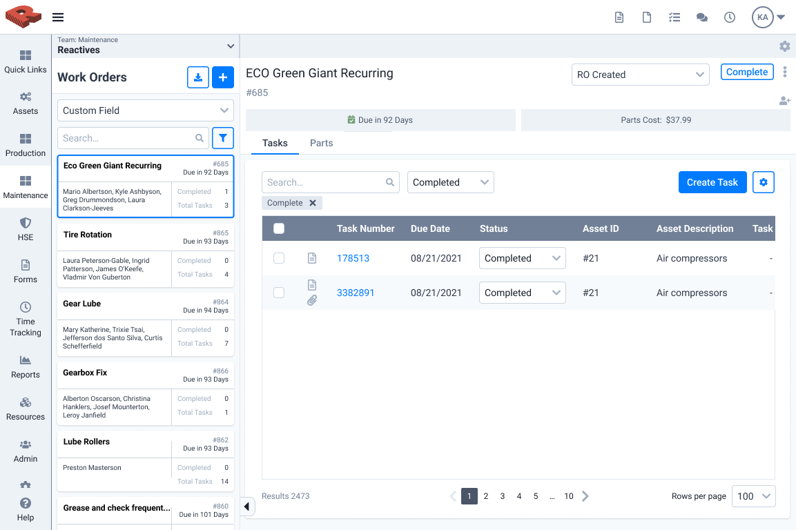
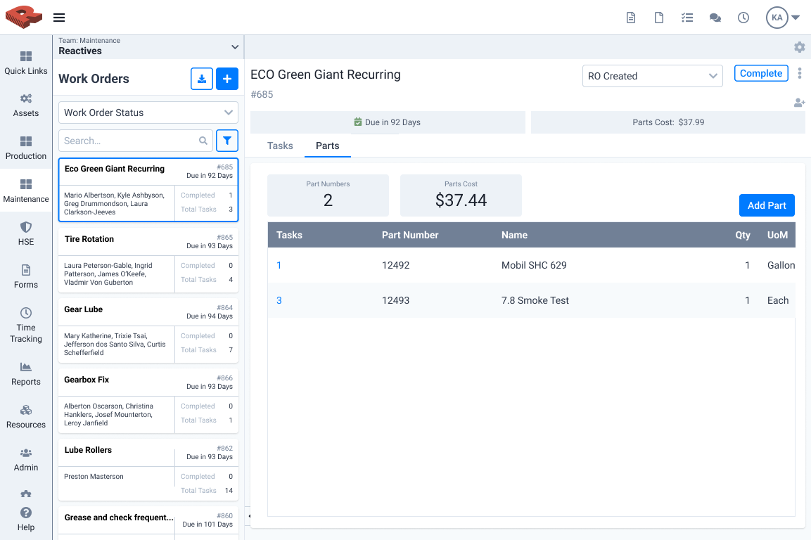
Redlist's user base continued to grow, but our onboarding/implementations team stayed the same. The Maintenance feature was built in the early days with little more than an idea on a napkin and a developer eagerly clacking on keys. It was a powerful piece of software but difficult to help new users learn. When a board had a realistic amount of work orders, opening them up to see the tasks inside created an awkward accordion that made it difficult to quickly check on various tasks over multiple work orders.
Exploratory Research
Our research started with customer interviews. We spoke with key stakeholders from our older accounts as well as those from our less experienced users. We compared what the veteran users said they liked about the current product with the frustrations new users had while learning the tool. Veterans liked how they could quickly find work orders with our powerful filters. New users hated how difficult it was to focus on one work order at a time. Seasoned users had learned what the various icons and initials meant. Redlist novices needed a translator. We set goals for the redesign around this feedback. We wanted at least a 40% decrease in maintenance related tickets submitted to customer support. We also hoped we could reduce the time users spent looking at their work boards, by at least 20%.
Early Designs
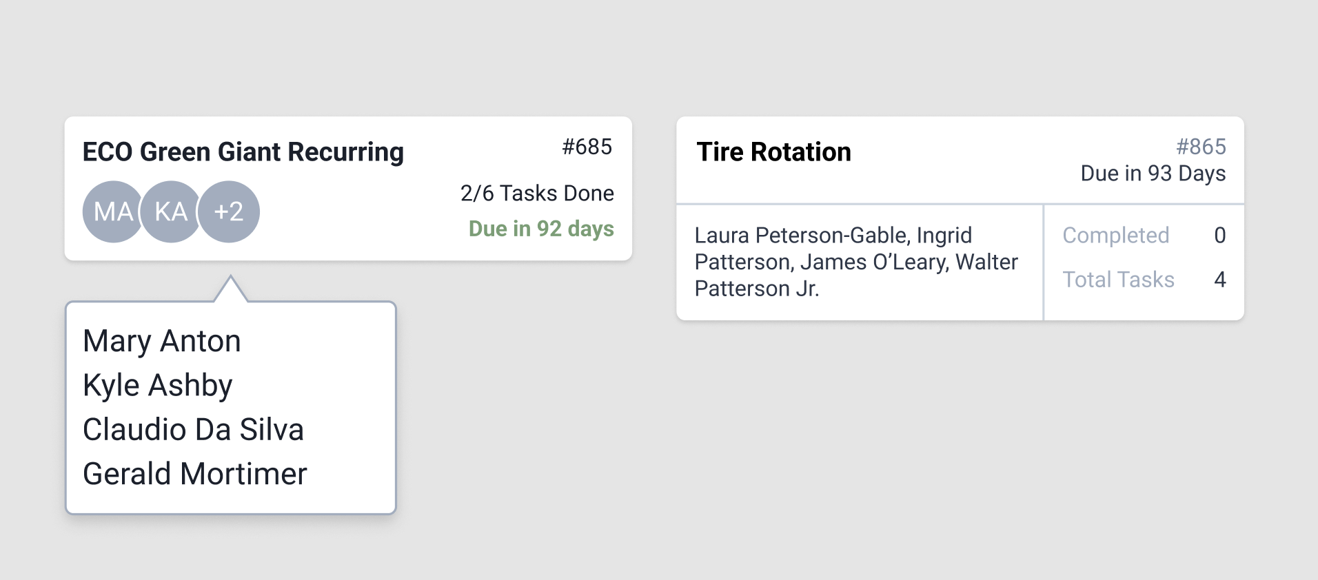
With a robust design system, we rarely did wireframes other than to visualize user journeys. In the year prior, another feature of our product had been redesigned, taking into account very similar feedback. That feature adopted a design with cards on the left representing different jobs that a team might have, where more in-depth information could be accessed by clicking on that card. We decided to use a similar design to see if that would address the core complaint that context was easily lost when staring at a table that could expand and collapse.
Testing
With rough prototype, testing tools like Maze, and a barrel full of enthusiasm, we set out to test our concept. We tested often, using both internal feedback and test sessions with our users. We initially assumed that we could eliminate the friction of understanding the assignment icon (a circle with the person’s initials) by introducing a tooltip that showed the person’s name, or the list of people if there were multiple. That was an assumption we got wrong and changed after testing.
Completion and Hand Off
After about 4 months of designing, testing, and iterating, I handed a design complete file to the product manager to write acceptance criteria. Our crack developer team got to work and launched a beta version of the new Maintenance tool.
Outcomes
After release, I waited anxiously for feedback. Through more customer interviews, I found it was a big hit with our new users and even some of our veterans. Our customer support team reported a 64% reduction in tickets related to issues finding maintenance task data. Our Pendo analytics showed a 37% reduction in time users spent on their work boards.