Background
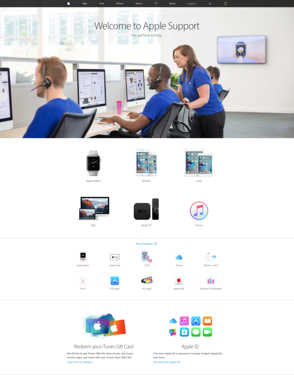
The current state of the Apple Support page is lackluster. Apple’s obsession with cutting down mass in their products has not quite reached their customer assistance portal. It’s horrendously fragmented; the first step a user must overcome is hunting for their issue within a laundry list of products.

This does not go unnoticed by the user, as we will see that the majority of surveyed visitors of the Support page have negative feelings about navigating the service.
Research
On a more positive note, my research showed that virtually 100% of Apple customers use the Apple Support page, which leaves a huge opportunity in terms of ROI from a redesign. I used a short survey to identify some common pain points that afflicted users. The survey was targeted toward anyone who regularly used an Apple product or service. These were the questions that the users answered:
- For what reason did you last visit the Apple Support page?
- How completely was your issue or question resolved?
- Did you have to speak to an AppleCare rep to resolve your issue?
- What are your top 3 resources to find help resolve issues with Apple products and services?
- What are your feelings upon first loading the Apple Support page?
- Is there a specific feature that is not present that you would like to see on the Apple Support page?
If the person had not used the Apple Support website, they could respond that they had not used it. If they had, they were given a blank field to express their thoughts and feelings about the service. My initial user research findings revealed that the first page of the Apple Support site left an overwhelming 83% of users with some feeling of confusion or being lost, as answers to questions #6 mostly fell in line with “where do I go?” or “how do I talk to someone?”.
These sentiments are echoed in the overwhelming 96% of respondents that reported they needed to talk with AppleCare Chat for their problem. The consequence of this feeling of uncertainty, coupled with the need to speak with AppleCare Chat most certainly led to the frightening statistic that 92% of issues took over an hour to resolve. The silver lining to all of this was, as was aforementioned, that virtually 100% of people surveyed did use the Apple Support page. The solution, therefore, seemed obvious: reduce the friction of resolving common problems.
User Personas
Before moving forward, I decided to come up with two user personas that could would represent common users of the Apple Support page. After some research and thought, I decided to split the personas into an average user and a power user. This dichotomy is common when discussing technology and I wanted to make sure the any possible redesign would benefit both groups. I came up with the personas of Sharon, the mom from Iowa from who uses her technology to enhance her life and Jeff, the software engineer from Texas whose life revolves around technology.

Evaluating Pain Points
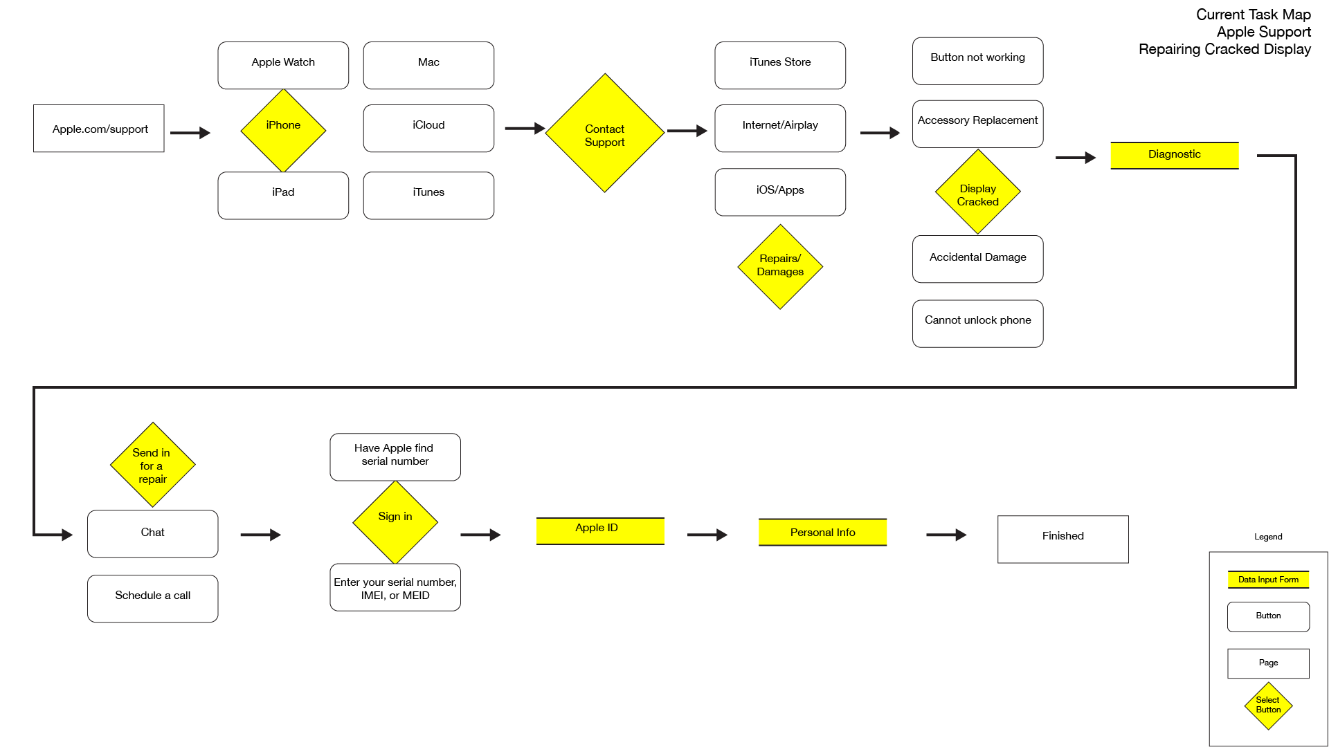
I focused on a common occurrence that brought users to the Apple Support page: submitting repair requests. People who experience hardware defects or damage, but do not live close to an Apple retail store, are forced to deal with either 3rd party, warranty-invalidating kiosks or the Apple Support page. I mapped out how many steps it took to on the current Apple Support page to arrange for a mail-order iPhone screen replacement. Taking how many screens one would have to click through and distilling them into separate, specified steps, I found it took more or less 8 steps to arrange for an iPhone screen repair via mail. I noticed that the main cause of such friction was an extreme, granular approach to the way Apple treated support. Instead of focusing on the type of help that the user wanted, Apple focused on which device needed the help and what kinds of issues that device could run into.

Removing Friction
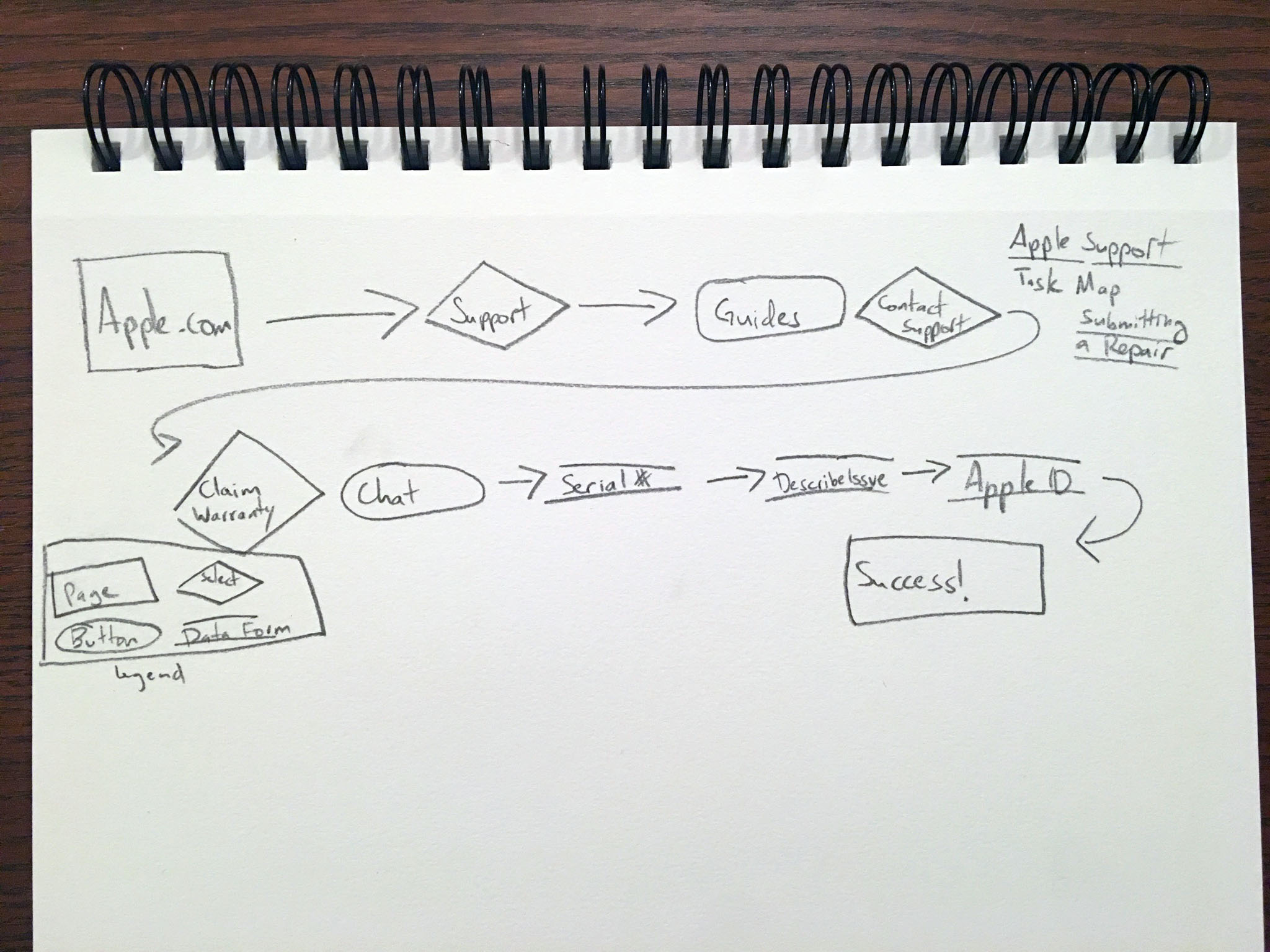
I decided that a lot of the process could be trimmed down by focusing on how the user wanted to be taken care of, instead of specific devices or errors. I instantly had a clear vision of how it could work and began playing with different flows.

Wireframes
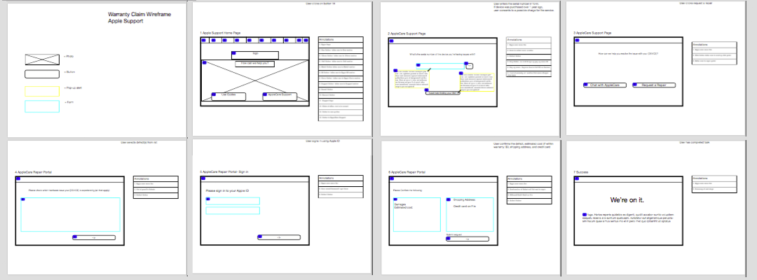
With a more concrete image in my head, I began creating wireframes. These are early wireframes that I began using for testing. A colleague asked me why didn’t the user log in to their Apple ID until almost the end of the process (similar to how the site works currently). I had originally thought that placing the login screen near the end of the task would ease some of the hassles and commitment anxieties that logging into an account could bring, but in practice, we found that having the user log in earlier, several more frustrating steps (such as typing in a serial number) could possibly be avoided.

High Fidelity Prototype
After several iterations and tests, I settled on this more streamlined experience. This specific prototype addresses the aforementioned common issue of submitting a repair request, in this case a cracked iPhone display.
If you see nothing below, then Invision is acting up and you can see the prototype here.
- This redesigned Support home page replaces the grid of product icons with a simple 2 option choice: use the support guides or contact support (which in layman’s parlance could be translated to “cut to the chase”).
- Upon selecting the “Contact Support” option, the user is taken straight to the Apple ID login page. This way, all of the info that Apple already knows about the user can be used to streamline any task that needs to done.
- After logging in, the user is greeted with a list of devices associated with their Apple ID. They can select which device brings them to Apple Support or in the rare instance that the device isn’t found, enter their serial number. If the user needs help with an Apple Service or software, they can select the “Need assistance with an Apple Service or software?” option.
- Upon selecting the device, the user has the option to enter the AppleCare Chat service or go straight into setting up the repair request.
- The user then selects the issue(s) they are having from the list, or selects “topic is not listed”, which brings up a field where the issue can be described.
- Finally, the user confirms their personal info (populated with backend data tied to the Apple ID), the estimated cost of repair (or replacement), and can add a final message to the ticket. All that’s left then is to submit.
- Now the task is complete. The user will receive an email with further instructions.
This redesign takes the same nightmarish 8 step chore and trims it down to 4 steps. Logging into the Apple ID account earlier as well as eliminating the optional diagnostic scan greatly streamlines the experience and works to assist the user in resolving the issue and not interrogating the user for information. These changes help to bring at least a part of the Apple Store legendary customer service to their online presence.
